Module 2 / Lesson 2.1: Perfect your branding
Perfect your branding
This is the very first step. Maybe you already have a visual identity you’re happy with or maybe you’re wondering where to start. Your visual identity, or branding, encompasses everything that makes you, you…so of course, you don’t want to mess it up! You could hire a graphic designer to do this work with you (if you can afford it) or you can come up with it yourself. After all, who knows you better than you do? If you’re worried you couldn’t possibly do it well, remember that sometimes, the simpler things work great.

You can listen to the lesson…(give it a second to load)
Or you can read it!
Create a great visual identity
First things first, what’s a visual identity? And what makes a great one? Your visual identity is composed of your logo, imagery, typography, colours…plus any symbols or pictograms you choose to use, or not. When creating your visual identity, you’re basically defining the creative direction of your illustration business (yes, it is a business). You’re deciding how you will show your work to the world. You already know by now that first impressions really count, so you should take your visual identity very seriously. Also, it’s super fun to create it! It might feel daunting to decide on all the elements described above, but remember that your visual identity can always evolve with you, the way your illustration work does. It doesn’t mean you shouldn’t try to get it right the first time though! So, let’s have a look at what you need to create:
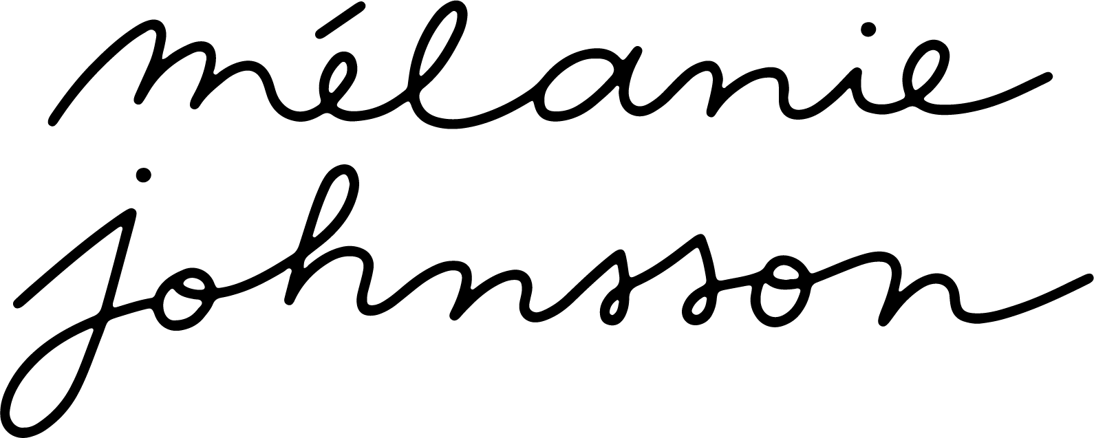
Logo: This could be your name, in your handwriting. A lot of illustrators have done this and I think it works great as it also works for you to sign your illustrations and prints. Brands and clients usually love it when your logo is your name as well, because it makes it easier to use when you collaborate. Otherwise, you could create a mark or wordmark that you love and reflects who you are and what you do. As you might have noticed, I have a wordmark, which is just a hand-lettered M for my name, Melanie. I created it ages ago and still love it. I have had to create another one with my full name that I sometimes use with clients, when they want to see my full name appear on collaborations (hence the good idea of creating a logo with your name straight away!).
Imagery: The way you present your work is almost as important as the work itself. It’s very unlikely that clients will visit you at your studio or your home to see your illustrations in person before they decide to work with you. So that’s where great photography comes into play. You need to invest in a good camera to be able to take great pictures of your original illustration work. You don’t have to worry about it if you only do digital work…although, you might want to print some of your work and take pictures of it as well! No matter what medium you use, there will be imagery on your website: images of your various collaborations, of your stationery bits, of markets you’ve sold prints and cards at, of yourself, of behind the scenes… What’s important is that you find a style of photography that you like and stick to it. Same goes for the editing of your photography. You need to be very consistent. Consistency is professional and reassuring. It’s also beautiful and satisfying to look at.
Typography: You will need to choose a typography for your website, your marketing materials, your invoices and contracts, your stationery bits… Even if you don’t print things straight away, it’s good to design it and figure out what you love. It’s important to stay consistent with your choice of typography across all your platforms. I would keep it simple if I were you, as the most important thing is for your illustration work to shine. You should aim to keep things sleek and modern, but remain playful if that’s what you’re about. Your choice of typography is a very personal one, you can choose a sans-serif like Futura (that’s what I’m using) or go for serif and play around with Georgia, Garamond or Didot. You’ve got a lot of options. A little tip for you, I would first and foremost check what typography is available on your website (may it be Squarespace, Wordpress, Wix, or something else) so you can pick something that’s truly available everywhere. If you choose something too niche to design your stationery, it may not be available to use on your website and your whole visual identity will lose some of its consistency.
To download fonts, you can check Google Fonts or if you’re subscribed to the Creative Cloud, get your typefaces from Typekit!
Colour palette: Ahh the colours. As an illustrator, this will probably be your favourite and most daunting part of creating your visual identity. But remember, you don’t have to go all out and crazy on the colours. You can truly let the colours in your work do the talking. Having said that, I think it can sometimes be lovely to have a restrained colour palette for your logo and stationery bits. It will keep things fresh and exciting. It’s your choice to go for either a bright colour palette or more muted tones. Again, you know yourself better than anyone and you’ll need to decide which colours will best represent you and what you’re about.
Other bits and bobs: Some illustrators like to create small symbols and/or pictograms to go alongside work on their website and on their stationery bits. I think this could be great! It’s a way of showing snippets of your work in a cute, small form… And you can put these little illustrations anywhere you like. They will infuse some life into your visual identity is a subtle way. You could even make Gifs out of them so you can use these on social media as well!
Nurture your website
Now that you’ve come up with a beautiful visual identity, it’s time to create (or update) your website. I have built mine on Squarespace, which I find to be the easiest platform to work with. You can choose from a lot of different templates and customise the look of your website quite a lot as well. If you’ve never bought a domain before, doing everything on Squarespace is seamless and practical. You can create your website super fast, buy a domain, an email address to go with it and you’re all set up! All that’s left to do is play around with the Site Styles and the Pages and make your dream website come to life. If you already have a domain, don’t worry, you can easily link it to Squarespace as well. If you already have a website which isn’t on Squarespace, that’s totally fine too! You could use Wordpress or Wix…I’ve heard good things on both but I’m definitely not an expert on those. Anyway, back to your website. Your website is a window into your world, hence the importance of nailing it. You want people to see what you’re about straight away. You want them to see your best work the minute they enter it. You want to show them your most beautiful and striking work as soon as possible, you don’t want them to have to look for it. That’s also why I tend to prefer more simple, sleek websites, which showcase the work well, instead of busy, complicated websites that can get quite fussy and make it hard to distinguish what the work is about. As an illustrator, your work is all visual…so let that do the talking. This doesn’t mean you shouldn’t build a beautiful and interactive website…but just play it cool.
I mentioned photography above and I will talk a little bit more about it now. It’s essential that you learn to take good pictures of your work. Even if you only work digitally, you will end up collaborating on products with brands and those products will need to be photographed. I hear you say that the brands might do their own photography and yes, indeed, they likely will! The thing is, when you receive the products you’ve collaborated on, I think it’s lovely to take your own pictures of them for your website and social media. I always have big sheets of coloured paper in my studio that I use as backgrounds for prints, greeting cards, books… They are great to make your work pop without being overpowering! You could use anything you like as a background, as long as it’s in line with what you and your work are about. Just remember to use a professional camera whenever possible and edit the photographs in a beautiful, coherent way.
Be consistent
I have talked about consistency a few times above…and I still want to talk about it. Why? Because consistency is very, very, very important. Making sure you have the same logo across all your platforms (Instagram, Twitter, Pinterest, your website…), making sure you use the same typeface on your website and invoices and notes to clients, making sure the photography you’re sharing is top-notch… Being consistent will make you look trustworthy and professional and that’s exactly what you need to get hired for your dream jobs.

How to take beautiful photos
•Use natural light or sunlight whenever possible
•If you live somewhere with less natural light, get yourself one of those LED lights
•Buy coloured sheets of paper to use as backgrounds (any good art supply shops will have them)
•Learn to use your camera in Manual mode so you have more control over the settings
•Always shoot the same product from different angles so you can choose your favourites when editing
•Use Camera Raw (a Photoshop plug-in) or Lightroom to edit all your photos at the same time and stay consistent.